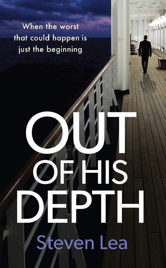
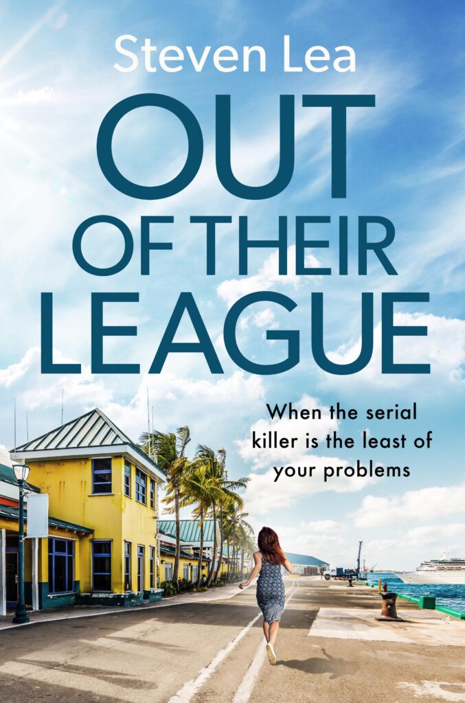
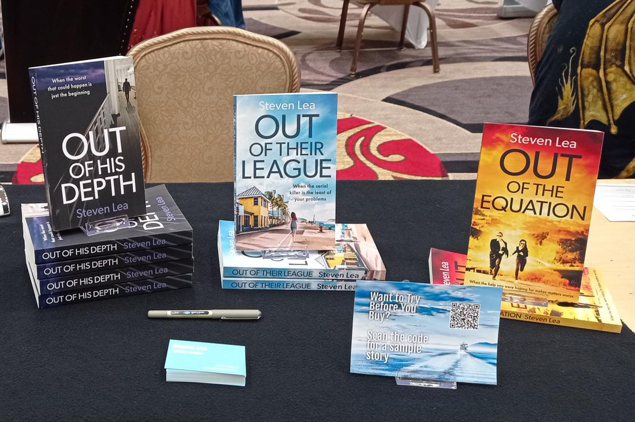
Let’s face it, we all do, don’t we? If it doesn’t look interesting it’s unlikely to be something we pick up or click on to find out more. So when it came to launching my first book I knew I had to get the cover professionally designed. It’s quite an expense for a first-time author but if the cover doesn’t do its job then people won’t necessarily get as far as reading it, no matter how good the actual story is.
Luckily I found a place on the internet that helps authors find designers, editors, marketing people, etc – all the things you need to finish off your new book. After asking questions of three candidates I settled on Nick Castle Design.
Choosing the cover for the first book was agony – what if I got it wrong? But at some point, you have to bite the bullet, so I chose one of the four that Nick created and went for it.
Subsequent books have been more exciting and easier, perhaps because I’ve had a better image of what I wanted before I saw the options. I’m pleased that these look similar but not identical, and are a variety of colours and moods.
I agonised again over the taglines – it’s amazing how, after writing sixty thousand words, you can struggle with a dozen more. But they’ve got to sum up what the book is about, even though the reader doesn’t know that yet. I also (this is the OCD bit, but I’m proud of it) made sure that the tagline for each book has the same rhythm. Go on, say them out loud in sequence and see for yourself (please… they took me ages).


